About Gecko Traxx
It is an Australian company currently based in Melbourne. It is on a mission to enable everyone to be able to get out and enjoy outdoor activities. They are beginnig a new project in the development of a new manual wheelchair to build on from the orginal Gecko products.
View here for all project details.
Client
Gecko Traxx
My role
Team Working – UX & UI Designer
Length of project
12 Weeks
Scope of project
Redesigning Web & New App Design
Assumed challenge
Find key insights on the pain points people experience when scripting a wheelchair.
Outcome
Deliver a new website that suits their new goals
Method
Double Diamond, Agile.
Problem
How can we improve the user experience of the scripting(measuring) process of a person before the custom manual wheelchair is built.
Pain points assumed by clients
- Occasionally data collected is input wrong, lead to many other problems.
- It's awkward to have someone poking and prodding while measuring.
- Users have no ideas what the product will look like.
Research
Research methods:
- 6 one on one interviews
- 40 online surveys
- Personas
- Customer flow
- Storyboard
- Prototype testing
Research goals:
- Understand overall experience
- Determine users' frustrations
- Understand what users need
- Understand online shopping experience
- Understand scripting process
Gathering insights
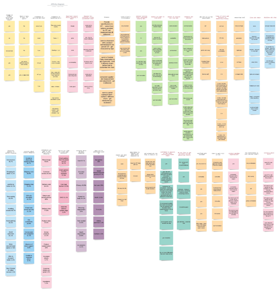
After finishing up our surveys and interviews, we put down all the data and organized them into groups. Click here to view clearer version.
Key insights
- Most people browse more than once per day
- 100% users have bought products online - 42% do so on a monthly basis
- Users want to see images, reviews, delivery cost/time when buying online
- Looks are the most important part of the in-person shopping experience
- Peopel want to learn more about how their chair is built and they want to see what they waiting on (tracking system)
-
78% of users would like to see a 3D representation of their final product
We also found out an important feedback from interviews, which is very different to what the client said:
All our interviewees said they don’t mind to be poked for measurement, they’d rather be poked to make sure the measurement is correct! Oops!
Persona and customer journey
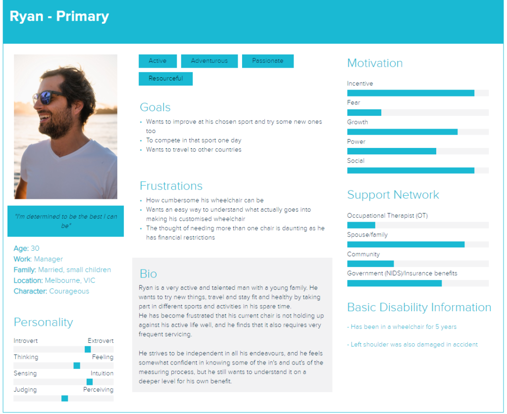
We then used all of the qualitative data to create Ryan, our primary user persona, to represent the info we gathered.
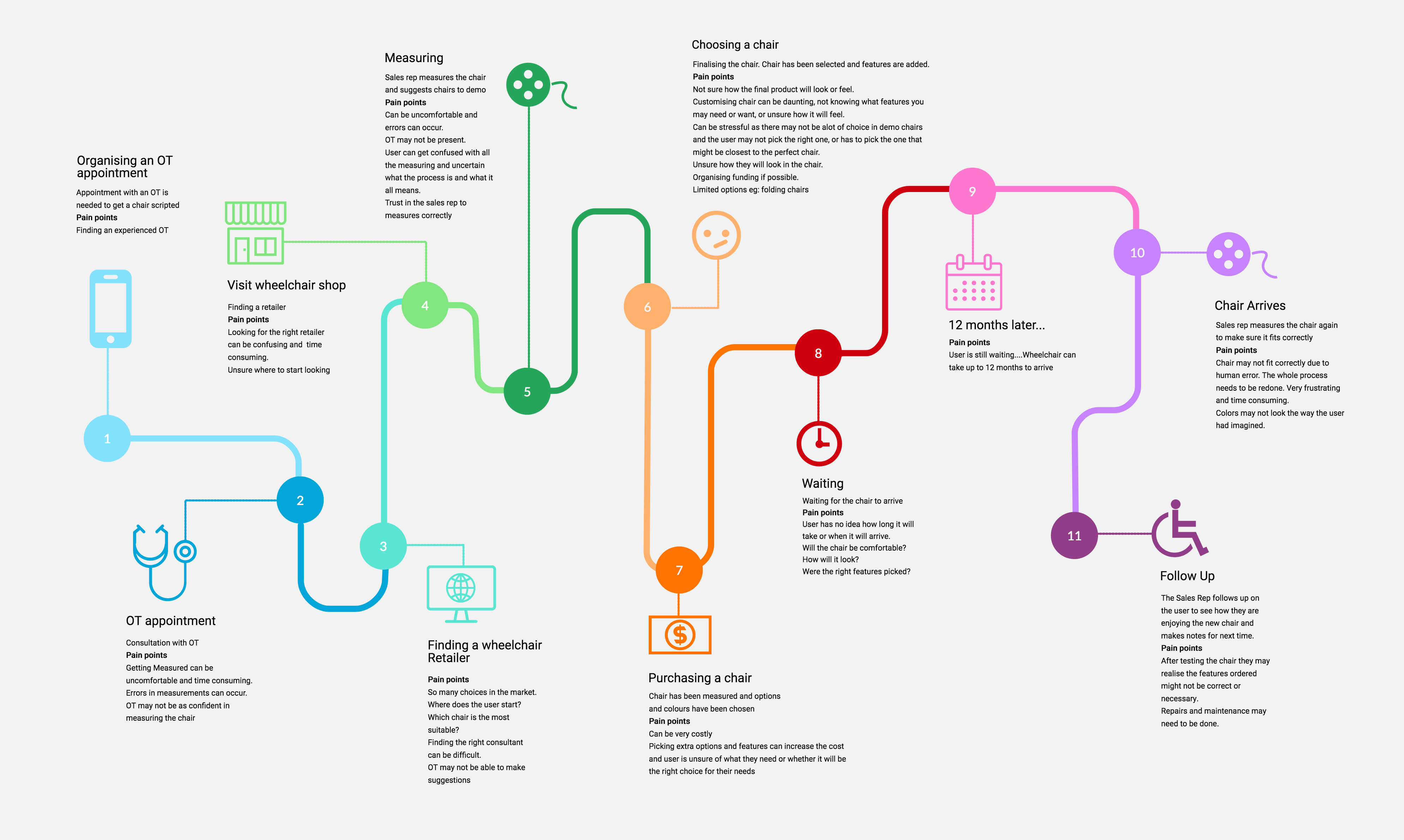
The customer journey map below shows the relationship and experience Ryan has with Gecko Traxx. At the same time it helps to focus on main problems and opportunities for design.
Problem statement
Users needing custom made wheelchairs are unsure if the final product will be comfortable, as currently there is no way to test how the final product will look and feel before confidently ordering a customized chair.
How might we
- HMW develop a way to streamline the measuring system for custom wheelchairs?
- HMW create a functional way to measure users for wheelchairs?
- HMW allow users to visualise a custom made product before ordering?
- HMW reduce chances of measuring error?
Brainstorm
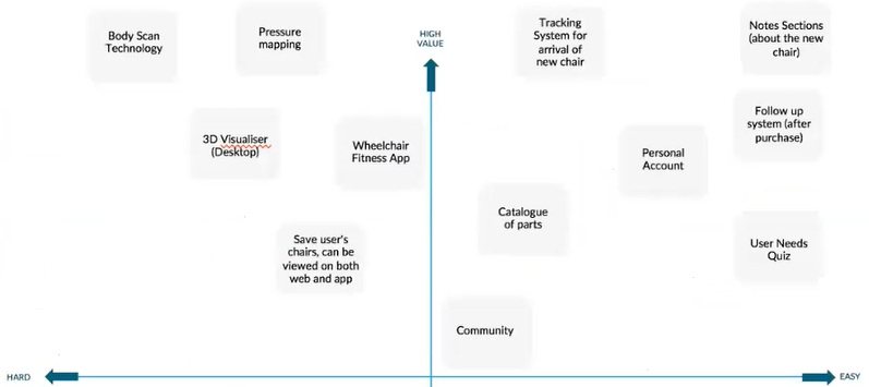
To address the HMW questions, the team sat together to come up with some ideas and put them onto the MVP map below.
Interactive Design
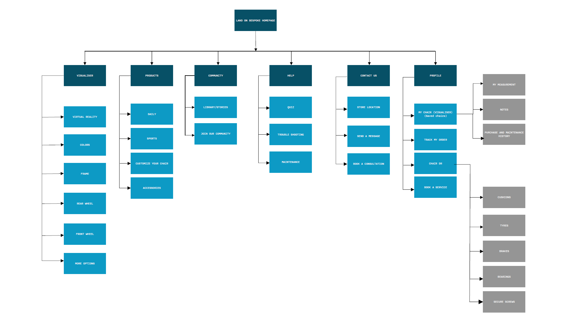
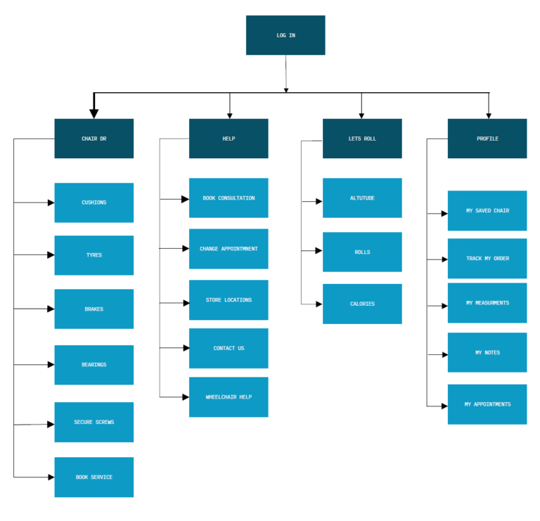
We completed information architecture for both web and app to imagine the ways a user might navigate through the designs to achieve their goals. These tools allowed us to ensure that the information was organized in a way that is intuitive to the user. View details here.
Web flow below:
App flow below:
Lofi wireframes
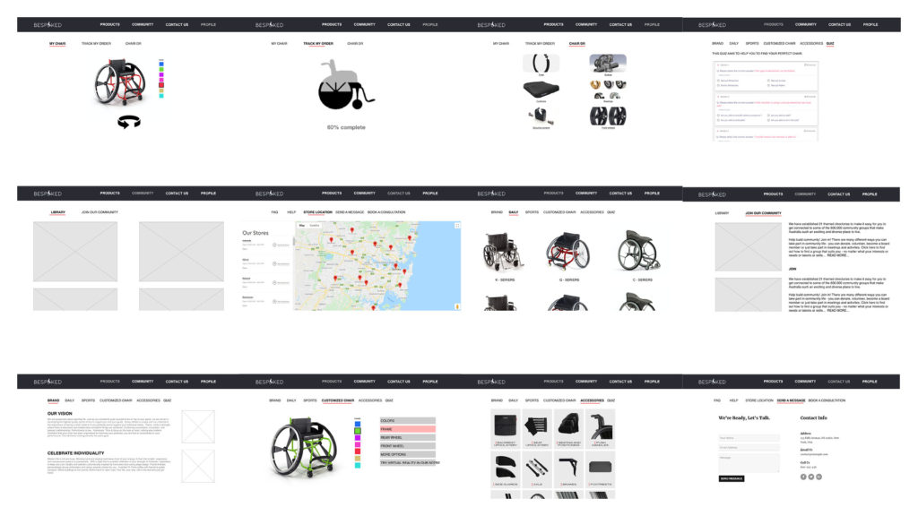
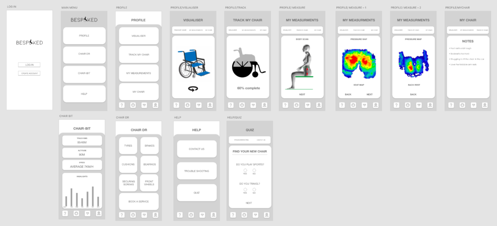
We began the process of wireframing with sketches of several of the main screens for the Artist Moments social feature. During this process, I thought about how the layout and content could be structured to satisfy user and business goals in a technically feasible way. The sketch I chose served as a guide for my digital wireframes.
Client consultation
We then had a meeing with client to discuss our work so far. He was very happy with the ideas so we decided to proceed alone this direction .
Hifi wireframes
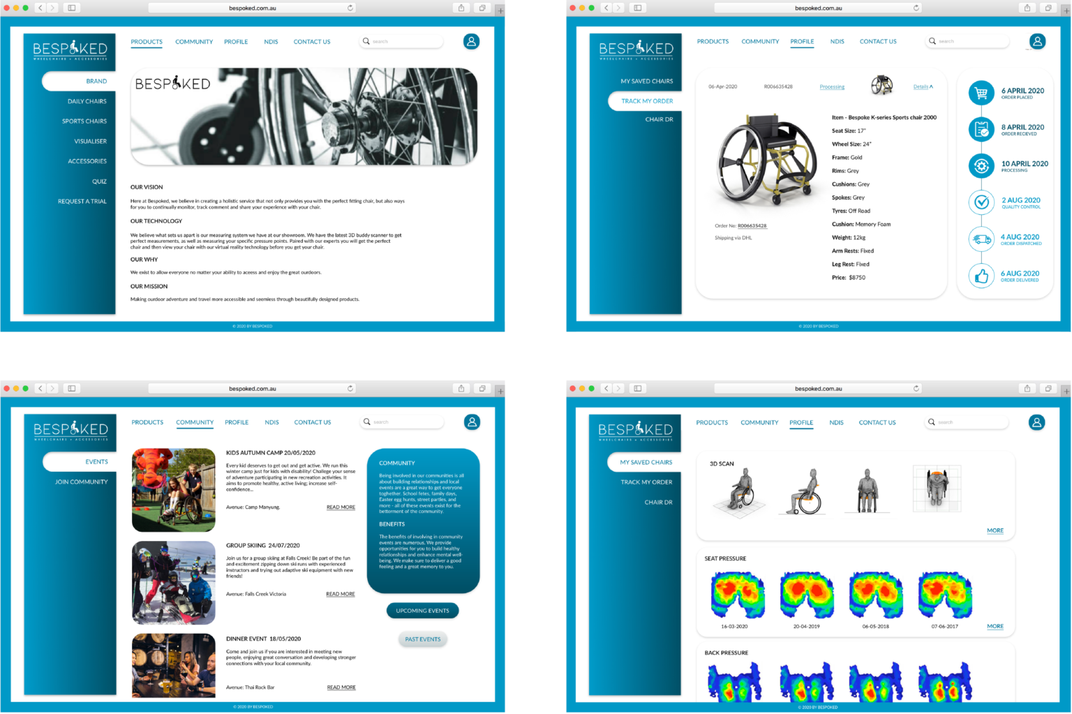
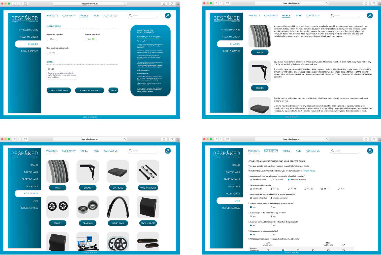
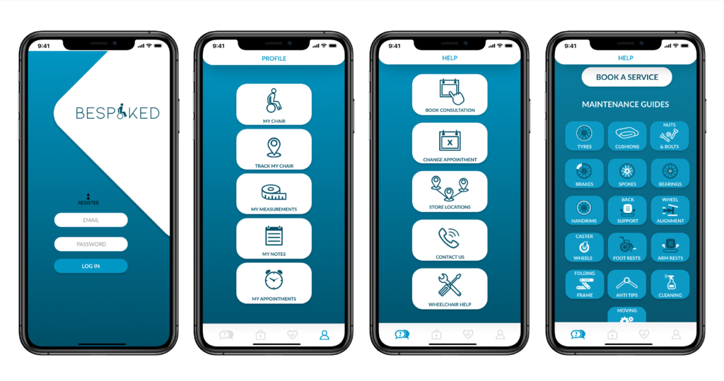
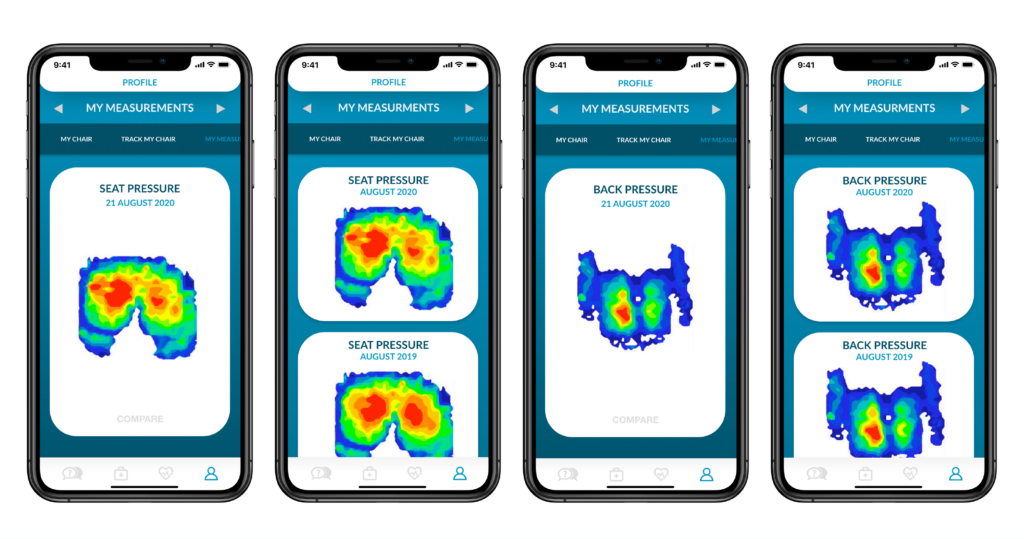
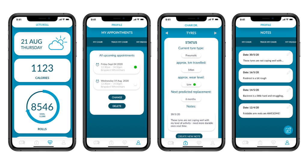
We finally came up with all the hifi wireframes for both web and app. See part of them below:


User testing
WEB TESTING RESULTS
- Map was added on the contact us page
- Chair Dr page looked similar to the accessories page (user was confused). Changed Chair Dr page to include maintenance information.
- Users liked the website overall and having the option to visualise their chair.
- User liked the colours and found the site easy to navigate.
APP TESTING RESULTS
- Needed to add a few enquiry/booking/confirm/delete/cancel buttons.
- Needed to add in mroe contextual information for the body scan page.
- Made pathway for creating a new note easier.
- Changed location of the blue bar.
- User liked the overall look of the app.
- User liked the idea of being to send a message to the company.
- Appointment section was confusing with booking service appointments.
Final prototypes
Feel free to explore the final prototypes below.
App prototype: Web prototype:
Reflection
Be critical about some assumptions delivered by clients becuase they might not be correct. We need to find out the real problems base on ture data.
