About Noobill
Noobill is an Australian Fintech startup based in Melbourne. They are applying mobile and AI technology to redesign how people receive and manage their daily services with far better digital experience and without bills. By reverse-engineer the pitfalls set up by suppliers, Noobill develops mobile and AI technology to actively check & compare every bill to make sure user is not overcharged and is always on one of the best deals.
View here for all project details.
Client
Noobill
My role
Team Working – UX & UI Designer: from research to final delivery
Length of project
12 Weeks
Scope of project
Redesigning App
Challenge
Redesign and simplify onboarding process.
Outcome
Deliver a new onboarding experience to improve conversion rate.
Method
Double Diamond, Agile.
Problem
Improve onboarding conversion rate by improving user education and onboarding journey.
Research
Research methods:
- 10 interviews
- 60 surveys
- Personas
- Customer flow
- Consultation with client
- Prototype testing
Research goals:
- Understand users' experience about onboarding process
- Determine the reasons of dropping off
- Identify areas for improvements
Key insights
01: Lack of control over the services:
- Not able to compare and choose a supplier on their own.
- Don't want to be forced to put down personal details before deciding to use the service.
- Lack of flexibility, e.g. change frequency of payment and methods of payment.
02: Lack of information transparency:
- Want to know details of Noobill's suppliers and why a supplier is chosen for user.
- Lack of clear explanation about switching process
- Want to have a look at some confidential data, e.g. number of ppl onboarded, average money saved.
03: Felt “Rushed along by the app”
- Need more time to understand the app before using the service.
- Lead to a feeling of distrust, unconfident and insecure to use the app.
Persona and customer journey
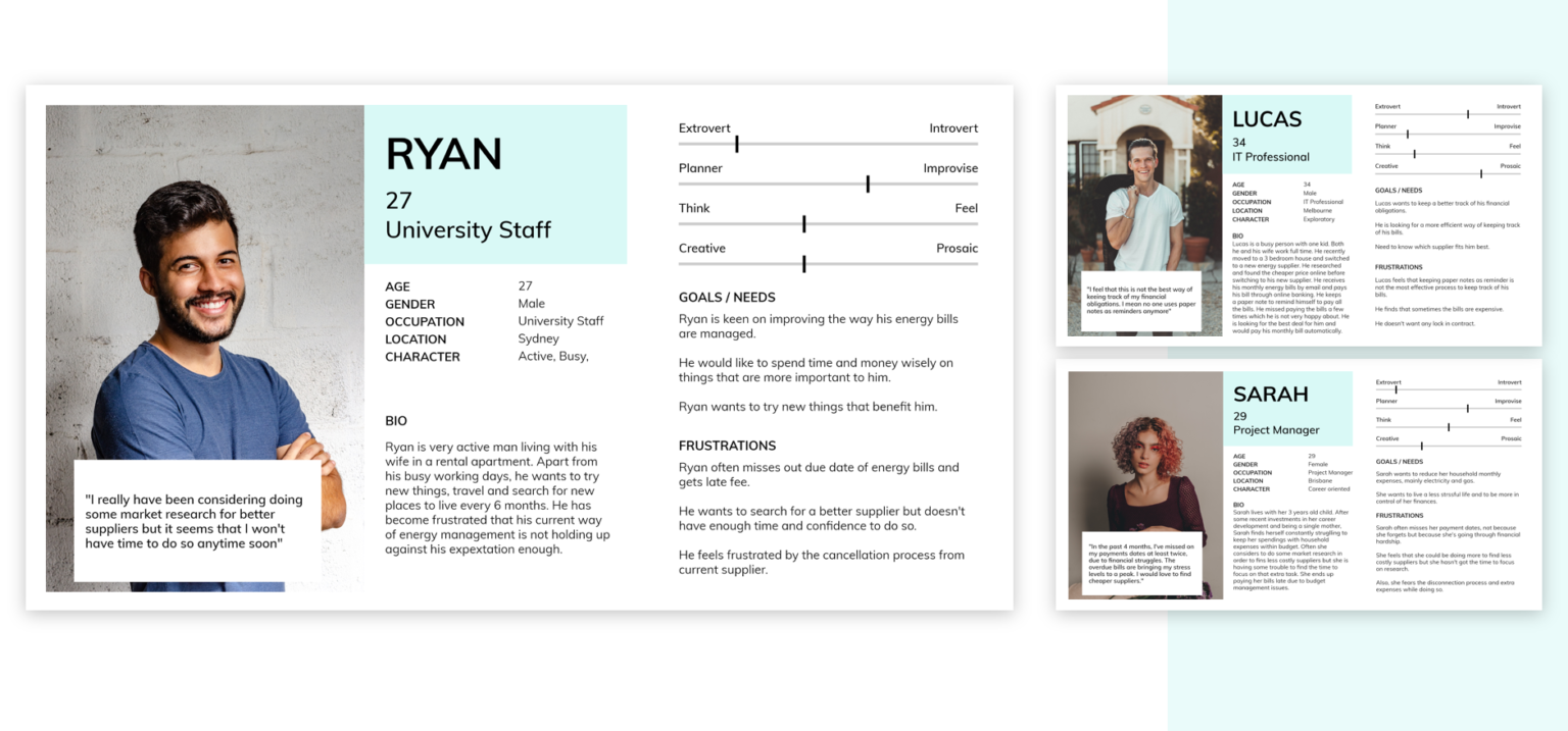
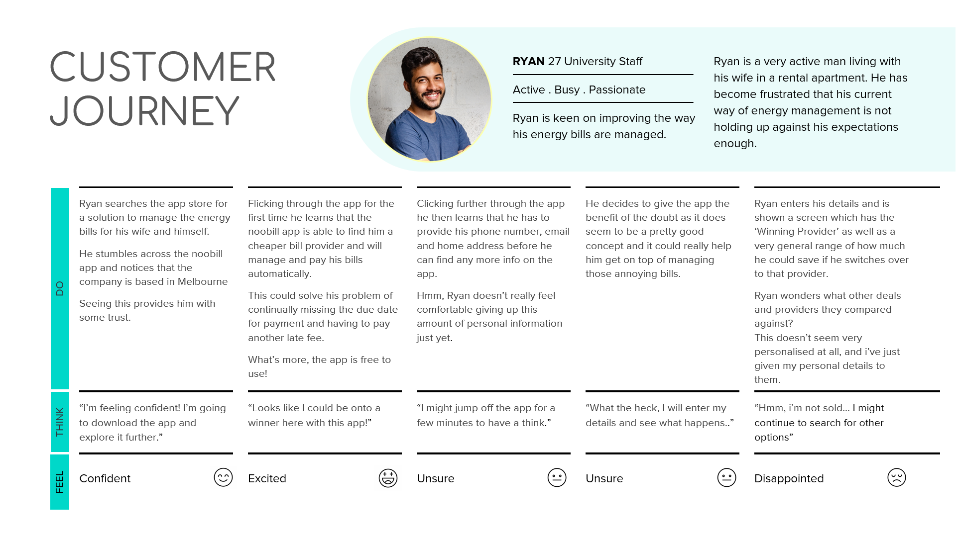
The customer journey map below shows the relationship and experience Ryan has with Noobill. At the same time it helps to focus on main problems and opportunities for design.
Problem statement
Users lack confidence and feel uncertain due to a perceived lack of information, transparency and control over Noobill’s onboarding process.
How might we
- HMW provide a seamless onboarding process so users feel a sense of trust and more control while switching to another supplier?
- HMW redesign the onboarding journey to allow users more flexibility and transparency while switching to a different supplier?
Brainstorm
To address the HMW questions, we as a group sat down and dicussed about possible ideas. We focused on the quick-wins as we already knew the client needed these changes which could be implemented in a short time.

Initial user flow
We then created our first user flow based on our MVP. View a clearer version here.

Lofi wireframes
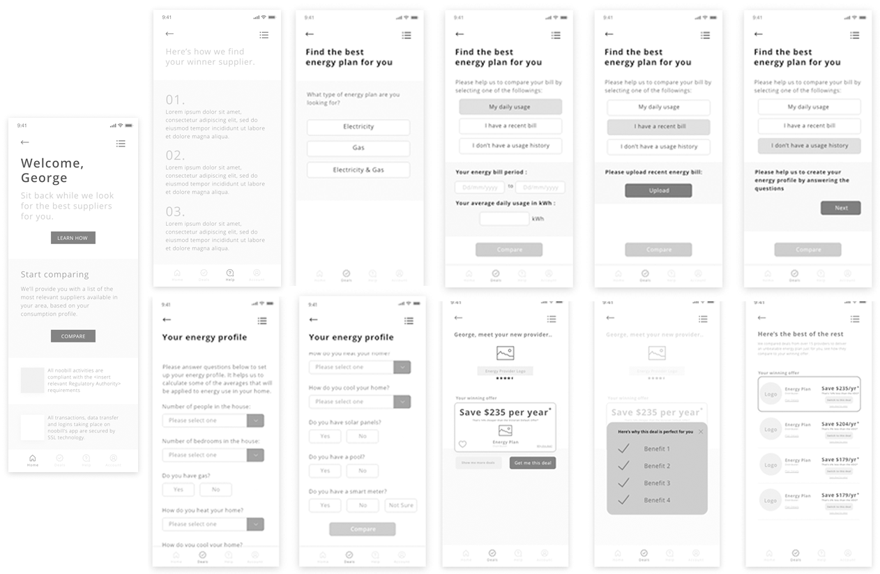
We completed these lo-fi wireframes to imagine the ways our users might navigate through the design.
Unexpected difficulty
We had a meeting with client to discuss the project. And it changed a lot to our design. The client pointed out a few things that didn’t deliver to us at the begining.
- Noobill's current business flow cannot support a flow that allow users to compare suppliers and prices on their own.
- Considering the plan, budget and time that Noobill has already invested in, it is suggested that it's better to improve the current version of the app to make it more flexible, transparent adn trustworthy, instead of designing a new app.
As a result of this meeting, the team, together with client, decided to take off part of our flow(which includes function that allow users to compare suppliers on their own) and embed a new flow that works for both client and tackling our problem statement.
We worked together for the final ideation and user flow based on client’s feedback, view below for details or here.

- Simple and easy sign up by reducing the steps to get into the homepage and let the user know more about how the app works.
-
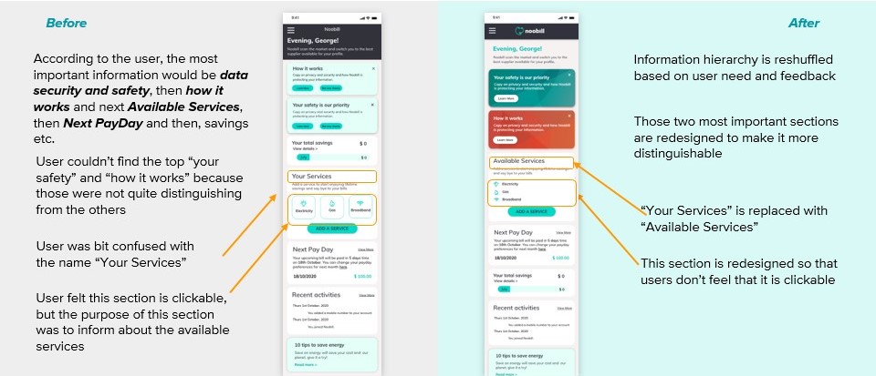
Redesigning the "Homepage" for building trust, confidence and transparency for the users by adding:
1. How it works
2. Data security adn privacy policy
3. Menu button which includes (FAQ, Contact us, Help, Notifications etc.) -
To make the app more flexible to the users
1. Optional payment methods are added
2. More payment periods are included (weekly, fortnightly, monthly & when due)
3. "Save for later" link button added - Clear explanation is provided to the users at each point whenever it felt necessary including (why the phone number is required, home address is required, clear notice before switching to Noobill suppliers)
Style guide
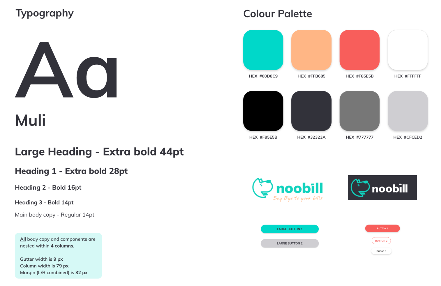
We make sure the design meets “AA” guidelines and remains consistent with the brand guide and brand identity.
Wireframing and user testing
Finally we created a high-fidelity prototype of Noobill in Adobe XD. Then started to do the user testing and iterations.
View full list of testing results here.
Final prototype
The client was very satified with it and decided to implement a few features that we suggested.
Feel free to navigate through the app on the right.
Reflection
It would be better that if we know more about client’s constraints earlier, instead of only knowing them half way through the project. It’s an important lesson for us that we should ask more questions to understand our client better instead of accepting what client delivered to us. Be a little more critical!

