Client
Amazon Audible
My role
Solo project – UX & UI Designer: from research to final delivery.
Length of project
12 Weeks
The challenge
Redesign features for Audible mobile app that improve user engagement.
Outdoor
Deliver a highly personal, interactive user experience prototype.
Method
Double Diamond, Lean.
Problem
Users who listen to audiobooks don’t enjoy the benefits of dog-earing pages, highlighting excerpts or leaving notes on their favourite pages, they also lose the nostalgic aspects of owning a book and watching it age.
Research
Research methods:
- 4 one on one interviews
- 40 online surveys
- Personas
- Customer flow
- Informative architecture
- Prototype testing
Research goals:
- Define users' common behaviors
- Determine users' frustrations
- Understand what users need
- What makes Audible experience satisfying
- Understand how users interact with others on app services
Gathering insights

Clustering interview and survey responses allowed me to discover trends and patterns from which insights could be constructed. Through this process I identified serveral user needs:
- To have a better search engine that can help them effectively narrow down their scope of searching
- To have more controls over personal and listening options
- To interact with other users
- To have both audio and text version of books
- To share experience to people on other platform
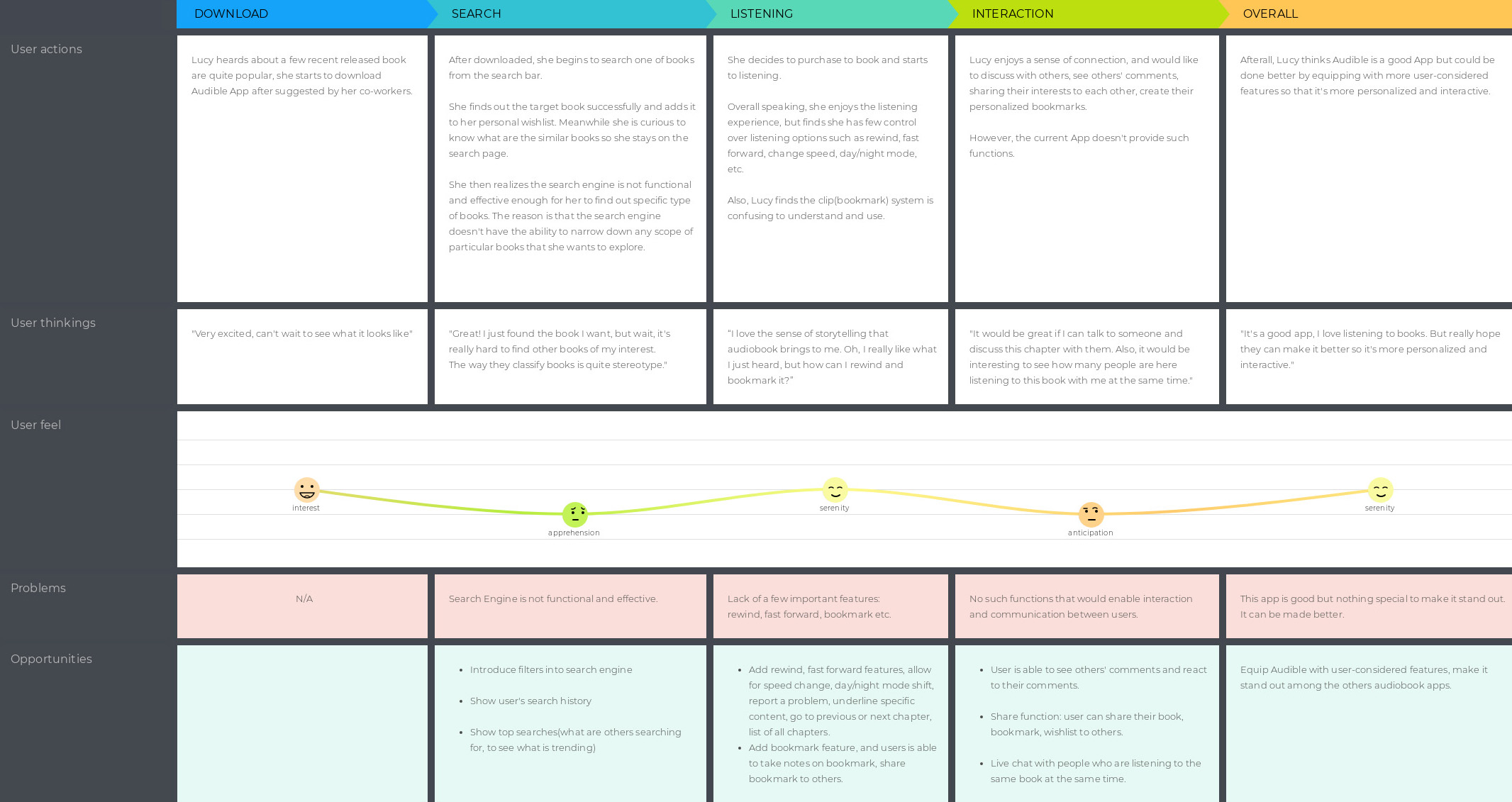
Persona creation and customer journey
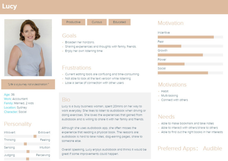
The customer journey map below shows the relationship and experience Lucy has with Audible. At the same time it helps to focus on main problems and opportunities for design.
How might we...
- HMW engage users so that they feel connected and interacted
- HMW provide personlisation so that users have more control over their experience
- HMW redesign the search engine so that users can have a better searching experience
Brainstorming
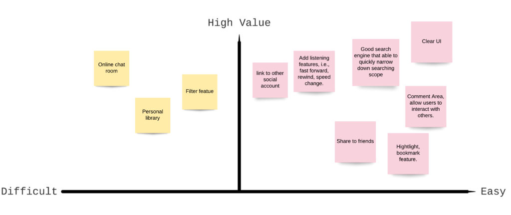
To address the HMW questions, I along with one participant, used crazy 8s and brain wiritng methods to ideate over 30 possible solutions. To access these ideas, I added them to MVP matrix to identify which ideas to move forwards with based on user. The final mvps below were a combination of “quick wins” and some “consideration features” hence were chosen to hit the original design brief(i.e., highly personalised, interactive and with more utility). To view full brainstorm sheet, click here.
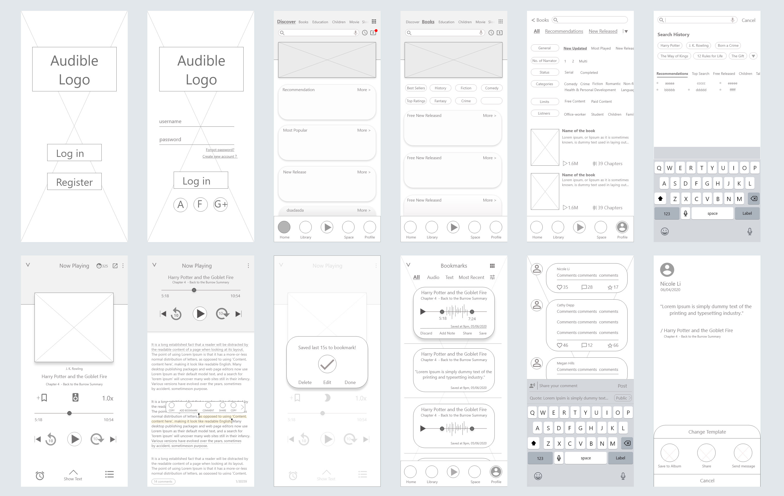
Lofi wireframes
I then began the process of wireframing with creating several of the main screens in Adobe XD. During the process, I thought about how the layout and content could be structured to achieve all the final mvps in a technically feasible way. View details here.
User Testing
My next step was to conduct user testing. To view full usability testing plan, click here. I asked participants to complete tasks, observed their actions, asked for their comments and made recommendations. I then redesigned relevant pages and features as shown below:
1. All participants pointed out that the size of image and text were a bit small to read. Also the gutter between images were unnecessarily wide.
Iteration: reorganised margin, used larger image and text size.
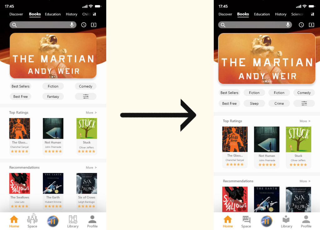
Click here to view the full list of testing results and iterations.
Hifi wireframes
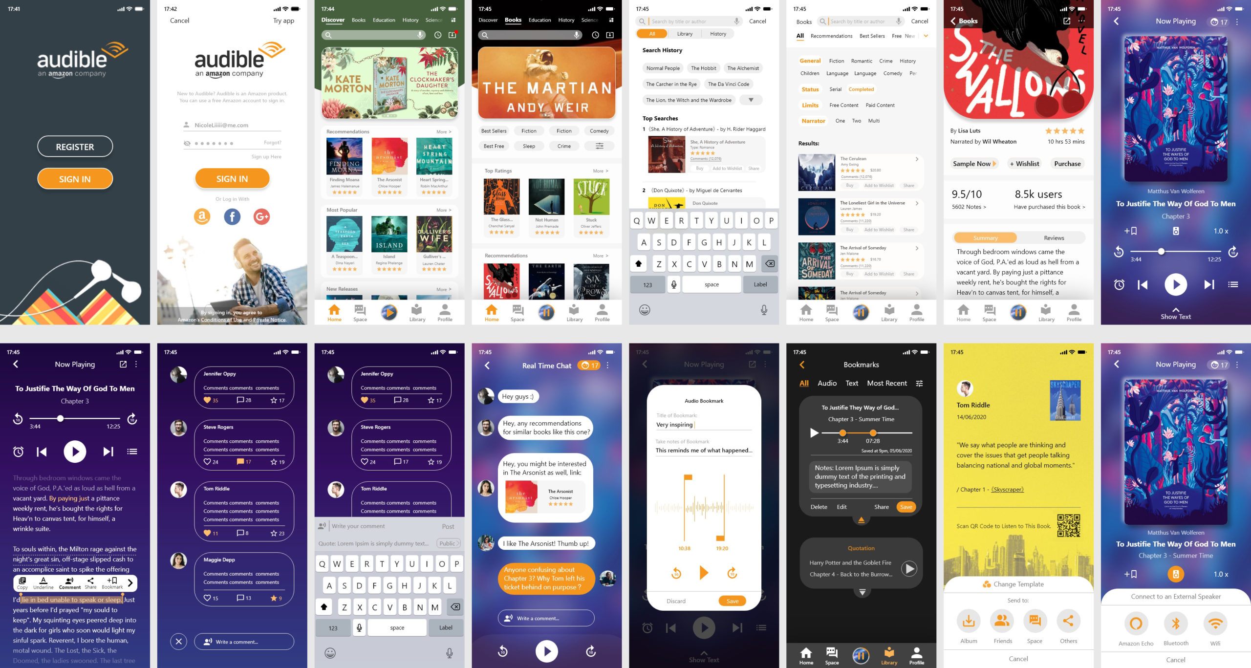
Final prototype
User testing doesn’t end after development. Design is a constant iteration of improving the experience for the end users. Always find ways to collect and listen to user’s feedback.
Reflection
The client was very satified with it and decided to implement a few features that we suggested.